Chromotherapy is a branch of medical science that deals with healing through colour. It is a concept that is more than proven with facts and, in fact, no building can be fully functional and suitable if it is not designed and decorated in an optimal way.
In this post, we are going to learn more about the importance of colour in hospitals, what are the main tones used depending on the room and what is achieved with each of them.
How does the perception of colour work in health?
Health is also in the colours. This is a fact that has been known for centuries. Not surprisingly, colour can accelerate your heart rate, balance your nervous system and regulate your body temperature. In other words: colour affects us emotionally and physically.
This is because colour does not exist in itself, but is an effect of the mind, a visual perception that is generated in the brain when it sees light reflected off an object.
It is the wavelength of the colour and its frequency that makes us see one colour or another. The retina picks up the wavelengths and sends nerve signals to the brain, thus generating the perception of colour.
In this sense, colour is vitamin for the cells, talking to us all the time, informing the brain and activating biochemical and hormonal processes in the body.
All this is the basis of chromotherapy, i.e. the improvement of health through colour.
Let’s look at how it works in real and practical perspective. The use of blue light lamps on newborn babies acts as a treatment for jaundice – yellowish skin due to excess bilirubin. Furthermore, in “colour therapy” complementary colours are balanced by being together. This is why green is so prominent in hospitals as opposed to red, for example in the surgeons’ clothes as opposed to the red of the blood.
In short: the intensity that colours have when intervening in the physical and psychological wellbeing of all people.
“In “colour therapy” complementary colours are balanced by being together. This is why green is so prominent in hospitals as opposed to red, for example in the surgeons’ clothes as opposed to the red of the blood.”
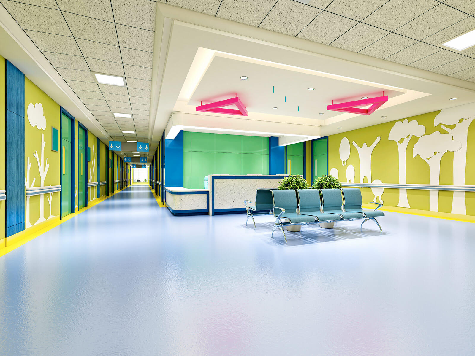
The binomial colour and medical care
We often forget the healing power of colour. As a rule, healthcare facilities have a practical, hygiene-focused aesthetic. But that is no longer the reality in modern hospitals, where it has become crucial to design an environment that stimulates recovery and healing through the use of colour.
That is why medical management and hospital equipment are putting more and more focus on how and which colours to use to promote the well-being of patients, visitors and staff.
The choice of each colour room by room
All colours, without exception, convey feelings and emotions to people, and thus to patients and staff. For this reason, it is crucial to know what kind of colours to choose for a hospital and for each of its rooms in order to transmit peace, security, confidence and cleanliness.
As we all know, most health centres have all their facilities in shades of white, green, blue or light grey. These are colours that help patients to improve their perception of where they are and also encourage recovery. But you have to go much further to get the most out of colours and their therapeutic function.
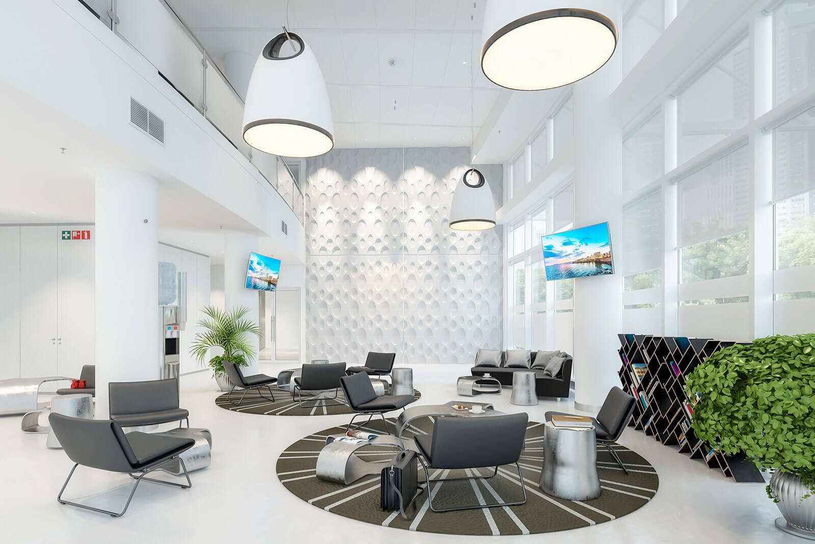
In fact, in more innovative and modern clinics and hospitals, white is much less present than in traditional centres.
- If we look inside, we see that waiting rooms have to be harmonious, using two or more colours, contrasting with curtains or other complements.
- In the corridors and staircases, light and soft tones should predominate, for example with the colour melon or a very soft blue.
- One of the most important places are patient rooms, because colours are decisive for the recovery of hospitalised patients. Soft and warm tones, such as cream or ivory, are ideal, always combined with shades that provide something more different to reverse the usual monotony. It is also necessary to point out that ceilings cannot be painted entirely white, as this can be depressing for those who are immobilised or bedridden.
- Blue-green, on the other hand, is the perfect shade for operating theatres & rooms.
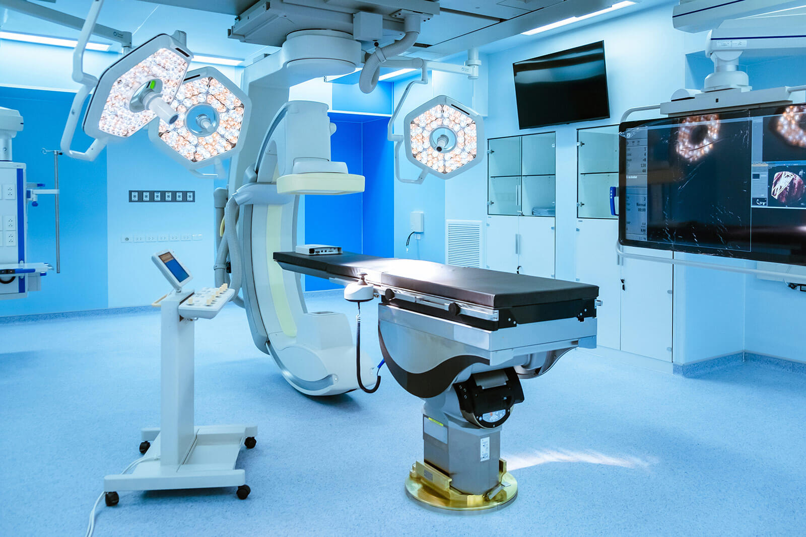
Each colour has its own use and function
All colours convey sensations and emotions and therefore influence both the mood of patients and healthcare staff. Let’s take a closer look at the most important and most commonly used colours:
Blue
Lowers the temperature and blood pressure, slows the pulse and breathing. It tends to relax the mind and reduce symptoms of stress and anxiety. This is why it is a very popular tone in clinics, hospitals, consulting rooms, waiting rooms…
Green
By bringing serenity and freshness, it transports the mind to nature, is considered the most relaxing colour for the human nervous system and is fundamental for the biophilic design of hospita
Yellow
Being related to the sun, it is capable of transmitting optimism, light and warmth.
Pink
Depending on its intensity, the warmer tones denote energy, youth and enjoyment, being ideal to combine in the nurses’ uniform or in the clothes of whoever is at the reception, but without abusing its use.
White
It is the colour that contains all the others, therefore it affects all the body systems. It is the colour of purity, cleanliness and simplicity, and the predominant colour in health services.
Orange
Stimulates the metabolism, making you feel cheerful and alert, so it should be used in the right measure, for example in rooms where depression and problems affecting the lungs and kidneys are treated.
Colours to avoid in hospitals
If the basic aim of colours in hospitals is to bring calm, tranquillity and promote well-being, there are some colours that should be avoided as far as possible. Starting with black, which is associated with seriousness, mystery and even mourning.
Grey is associated with tiredness or demotivation, while brown reflects impurity.
On the other hand, although orange is stimulating, excessive use should be avoided, especially in areas of mental health, as it intensifies moods.
Red is associated with blood, increases muscle tension, activates circulation and accelerates palpitations. In excess, it can cause stress, nervousness, anxiety, lack of concentration… It should therefore be kept away from surgery and cardiology facilities.
Finally, yellow should never be used in neonatal and maternity wards, as it makes babies cry more and makes it more difficult to identify jaundice.
Hospitals full of colour for the little ones
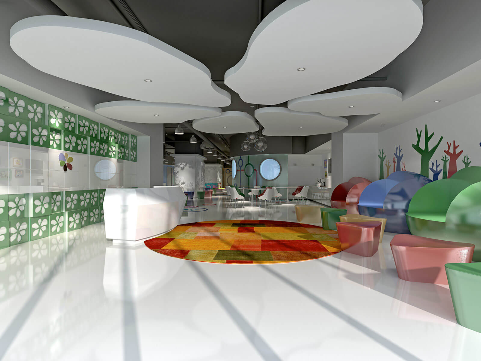
Opting for a good colour design in the hospital marks a before and after in the staying of kids in hospitals. From overwhelming white, aseptic green and metallic grey, we have to move on to more colourful and cheerful colours. In this area, there are many initiatives that make up for this lack of brightness and creativity in health centres.
It is to move from the “unit of pain” to the “unit of colour”, making the child forget everything around him. This is what hospitals such as the Reina Sofia in Cordoba have achieved in their Maternal and Infant area, where the walls are profusely decorated with the elements of the planet (forests, animals, seabed…) and the galaxy.
This is also the case of the Hospital Sant Joan de Déu (Barcelona) with its fairytale, fantasy and colourful scenes.
And even the Disney factory itself is immersed in this trend, with the Disney Coloured Hospitals project, transferring its most famous characters to the rooms of children in hospital.
Conclusion
White is the most prominent colour in hospitals, either inside or on the façade, due to the sense of peace and cleanliness it conveys. Blue and green tones are the favourite colours of the healthcare personnel who care for and look after the health of patients. The most striking colours are reserved for rest areas, waiting areas for relatives and/or areas for the recovery of the youngest patients.
From here, the main objective is that the patient feels safe, protected and directed, through the correct use of colours in each element of the hospital, to their recovery and wellbeing while they are in the health centre.



1 Comment